
Website Color Psychology: Impactful Choices for Businesses 2025
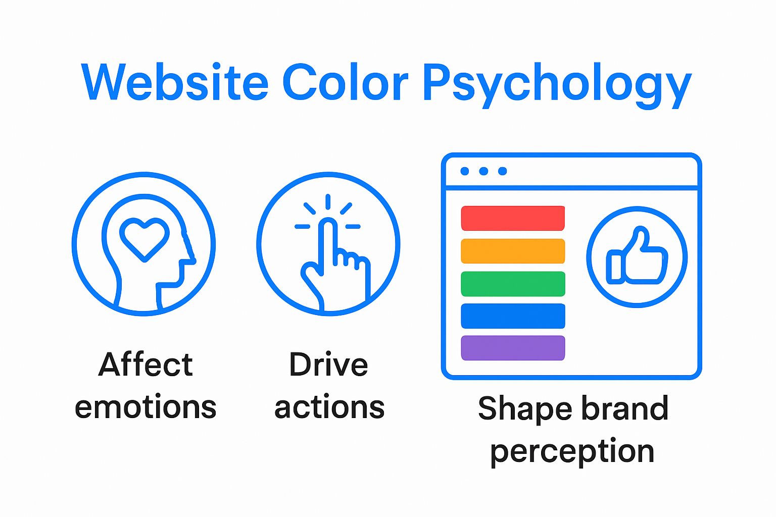
Website color psychology is about much more than picking your favorite shades for decoration. Studies show that users form an impression of a site in as little as 50 milliseconds, based almost entirely on visual cues like color . Most assume choosing the right hues is an afterthought or just about matching your brand logo, but get ready for a shock. The colors you select actually trigger subconscious reactions that can quietly boost trust, increase conversions, or send visitors running before your content even loads.
Table of Contents
- Understanding Website Color Psychology Principles
- How Colors Influence User Emotions And Actions
- Best Practices For Choosing Website Colors In 2025
- Website Color Strategies For Business Growth
Quick Summary
| Takeaway | Explanation |
|---|---|
| Colors influence emotions and actions. | Different colors evoke specific emotional responses, guiding user interactions and decision-making on websites. |
| Choose colors based on brand identity. | Selection of colors should reflect brand values and connect with target audiences emotionally to enhance recognition. |
| Implement strategic color palettes. | Develop color strategies by selecting primary and accent colors that resonate with users and create visual hierarchy. |
| Prioritize accessibility in color use. | Ensure color combinations provide adequate contrast for readability, accommodating users with visual impairments. |
| Aesthetics impact first impressions. | Users form quick impressions within milliseconds, making careful color and design choices critical for engagement. |
Understanding Website Color Psychology Principles
Website color psychology represents a critical strategic approach that transforms digital interfaces from mere visual displays into powerful communication tools. Colors are not just aesthetic choices but sophisticated psychological triggers that directly influence user perceptions, emotions, and behavioral responses.
The Neurological Impact of Color Perception
Research published in Computers in Human Behavior reveals groundbreaking insights into how website colors interact with human cognitive processes. Neuroimaging studies demonstrate that specific color selections can elicit measurable neurological responses. Blue hues, for instance, generate positive cognitive reactions and create a sense of psychological relief in users’ prefrontal cortex.
The psychological mechanisms behind color perception are complex and multifaceted. Colors communicate subtle messages that transcend linguistic barriers, triggering instantaneous emotional and cognitive reactions. A website’s color palette can communicate trustworthiness, energy, calmness, or professionalism within milliseconds of user interaction.
Cognitive and Emotional Responses to Website Colors
Research in Displays journal demonstrates that strategic color choices significantly influence user interactions. Different colors activate distinct psychological pathways, affecting navigation behavior, information retention, and overall user engagement.
Consider the following color psychology principles:
- Blue : Communicates professionalism, trust, and stability. Frequently used by financial and technology companies to establish credibility.
- Green : Represents growth, harmony, and environmental consciousness. Ideal for brands emphasizing sustainability or wellness.
- Red : Signals urgency, excitement, and passion. Effective for creating immediate visual impact and driving action.
- Purple : Suggests creativity, luxury, and sophistication. Often employed by brands targeting premium market segments.
Scientific Foundations of Color Psychology
A comprehensive review in Psychological Bulletin emphasizes that color perception extends beyond aesthetic preferences. Colors carry profound psychological meanings that significantly impact human affect, cognition, and behavioral patterns.
Businesses must approach website color selection as a strategic decision. The right color combination can enhance user experience, improve brand recognition, and ultimately drive conversions. However, color psychology is not a one-size-fits-all solution. Cultural contexts, individual preferences, and specific industry norms play crucial roles in determining effective color strategies.
Understanding these nuanced principles empowers businesses to create digital experiences that resonate deeply with their target audience, transforming websites from static interfaces into dynamic communication platforms that speak directly to users’ subconscious minds.
How Colors Influence User Emotions and Actions

Colors function as powerful psychological triggers that go beyond visual aesthetics, serving as sophisticated communication tools that shape user emotions, perceptions, and behavioral responses on digital platforms.
Emotional Engagement Through Color Selection
Research from Behavior & Information Technology reveals intricate connections between color choices and emotional responses. Different color tones activate specific psychological pathways, creating nuanced emotional landscapes that influence user interactions.
Blue tones, for instance, generate feelings of trust and calmness, making them ideal for professional websites seeking to establish credibility. Red hues, conversely, create a sense of urgency and excitement, effectively driving user actions and click-through rates. These emotional triggers operate at a subconscious level, guiding user behavior before rational decision-making processes engage.
Psychological Dimensions of Color Interaction
A doctoral dissertation from Walden University provides compelling insights into how color palettes impact user perception and engagement. The research demonstrates that color selection significantly influences users’ psychological experiences on digital platforms.
Key emotional associations include:
- Warmth and Comfort : Soft earth tones and muted oranges create feelings of safety and approachability.
- Professionalism and Authority : Cool grays and deep blues communicate competence and reliability.
- Energy and Excitement : Vibrant reds and oranges stimulate action and create a sense of dynamic movement.
- Tranquility and Balance : Green and light blue shades evoke feelings of harmony and stability.
Strategic Color Implementation for User Conversion
Successful website design requires strategic color psychology implementation. Colors are not merely decorative elements but sophisticated communication tools that guide user attention, influence emotional states, and ultimately drive desired actions.
Businesses must approach color selection as a critical strategic decision. Understanding the psychological implications of different color palettes allows for creating digital experiences that resonate deeply with target audiences. The goal is not just visual appeal but creating an intuitive emotional journey that aligns with brand messaging and user expectations.
By thoughtfully integrating color psychology principles, websites can transform from static interfaces into dynamic platforms that communicate complex emotional narratives, guiding users through carefully crafted psychological landscapes that enhance engagement, trust, and conversion potential.
Best Practices for Choosing Website Colors in 2025
Selecting the right color palette for websites in 2025 requires a strategic approach that balances psychological insights, brand identity, and user experience design. Successful color selection goes beyond aesthetic preferences, demanding a nuanced understanding of digital interaction dynamics.
Strategic Color Palette Development
Research in Computers in Human Behavior reveals specific color recommendations for optimal web design. The study identified royal blue (R65, G105, B225), slate blue (R106, G90, B205), and dark blue (R0, G0, B139) as particularly effective colors for creating positive user interactions.
Effective color strategy involves multiple considerations:
- Primary Color Selection : Choose a dominant color that represents your brand’s core personality
- Accent Color Development : Select complementary colors that create visual hierarchy
- Emotional Alignment : Ensure color choices match intended user emotional responses
To help you compare the emotional associations, common uses, and effects of different website colors discussed throughout the article, here’s a summary table:
| Color | Emotional Association | Common Uses | Effect on Users |
|---|---|---|---|
| Blue | Trust, professionalism, relief | Finance, tech, professional sites | Builds credibility, calms |
| Green | Growth, harmony, stability | Environmental, health & wellness brands | Conveys wellness and balance |
| Red | Excitement, urgency, passion | Calls to action, sales, energetic brands | Stimulates action, creates urgency |
| Purple | Creativity, luxury, sophistication | Premium, creative, luxury brands | Implies innovation, affluence |
| Orange/Earth | Warmth, comfort, approachability | Friendly, safety-oriented, service brands | Creates a welcoming feel |
| Gray | Professionalism, authority | Corporate, tech, minimalist designs | Communicates reliability, neutrality |
| Yellow | Happiness, optimism | Brands emphasizing positivity, youthfulness | Lifts mood, grabs attention |
Color Psychology and User Interaction
Research from ResearchGate highlights blue’s remarkable versatility in web design. Different blue shades communicate distinct emotional messages: lighter blues suggest calmness and serenity, while darker blues convey authority and confidence.
Practical color application requires understanding specific psychological triggers. Color psychology studies demonstrate how colors influence user behavior:
- Red stimulates excitement and urgency, making it ideal for call-to-action buttons
- Blue promotes trust and dependability, perfect for financial and professional websites
- Green represents growth and harmony, suitable for wellness and environmental brands
- Purple suggests creativity and luxury, effective for innovative or premium service platforms
Technical Considerations for Color Implementation
Modern web design demands technical precision in color selection. Designers must consider accessibility, readability, and cross-device consistency. This involves selecting colors with sufficient contrast, ensuring legibility across different screen types, and maintaining brand coherence.
Color accessibility is particularly crucial. Websites must accommodate users with visual impairments by selecting color combinations that provide clear visual distinction and meet Web Content Accessibility Guidelines (WCAG).
Businesses should develop a comprehensive color strategy that extends beyond aesthetic preferences. A well-designed color palette communicates brand identity, guides user attention, and creates seamless digital experiences that resonate with target audiences.
By integrating scientific insights with creative design principles, organizations can transform their websites from simple interfaces into powerful communication tools that engage users on psychological and emotional levels.
Website Color Strategies for Business Growth
Website color strategies represent a critical component of digital business growth, transforming visual design from aesthetic choices into strategic tools for driving user engagement, conversion, and brand perception.
Emotional Branding Through Color
A comprehensive study analyzing 644 companies’ logos reveals fascinating insights into the intricate relationship between color selection and emotional resonance. The research demonstrates that different colors trigger specific emotional responses, providing businesses with a nuanced approach to brand communication.
Red and gray emerge as versatile colors prevalent across emotional categories, while specific colors demonstrate targeted emotional associations. Yellow connects with happiness, blue with trust, and green with growth. These insights enable businesses to strategically select colors that align precisely with their brand narrative and desired emotional outcomes.
Below is a quick table summarizing the key research findings on how specific colors associate with key emotional qualities in business branding:
| Color | Emotional Quality | Research Finding/Use Case |
|---|---|---|
| Red | Versatile, excitement, urgency | Used broadly; peaks for excitement & urgency |
| Gray | Versatile, neutrality/professionalism | Used for neutrality and minimalist branding |
| Yellow | Happiness, positivity | Predominant in brands targeting joy |
| Blue | Trust, dependability | Common for companies wanting credibility |
| Green | Growth, balance | Favored by wellness/environmental brands |
| Purple | Luxury, creativity | Used for premium, creative segment |
Visual Intensity and Conversion Optimization
Research exploring visual web design strategies introduces a groundbreaking method for balancing visual elements to maximize user conversion. The study reveals a critical insight: excessive visual stimulation can negatively impact user experience, but a precise saturation point exists where conversion rates peak and negative responses minimize.
Key strategies for visual optimization include:
- Gradual Visual Refinement : Incrementally adjust design elements to find optimal engagement levels
- Color Contrast Management : Create visual hierarchy without overwhelming users
- Emotional Color Mapping : Align color choices with specific business objectives
Aesthetic Design and First Impressions
An innovative study on website aesthetics highlights a remarkable phenomenon: users form initial website impressions within just 50 milliseconds. By utilizing fuzzy logic to analyze color harmony and design elements, researchers demonstrated how critical visual composition is in determining user perception and engagement.
Businesses must recognize that website color strategies extend far beyond mere decoration. Colors function as silent communicators, instantly conveying brand personality, professionalism, and emotional resonance. A well-crafted color palette can transform a standard website into a powerful communication instrument that speaks directly to users’ subconscious expectations.
Effective color strategies require a holistic approach that integrates psychological insights, brand identity, and technical design principles. By understanding the nuanced interactions between color, emotion, and user behavior, businesses can create digital experiences that not only attract attention but also foster meaningful connections with their target audience.
Ultimately, website color selection is a sophisticated art form that blends scientific understanding with creative expression. Successful businesses will leverage these insights to develop digital interfaces that are not just visually appealing, but strategically designed to drive growth, build trust, and create lasting impressions.
Frequently Asked Questions
What is website color psychology?
Website color psychology examines how colors influence users’ perceptions, emotions, and behaviors when interacting with a website. It involves selecting colors strategically to enhance user experience and drive desired actions.
How do colors impact user emotions?
Different colors evoke specific emotional responses from users. For example, blue is associated with trust and professionalism, while red can create urgency and excitement. Understanding these associations helps businesses optimize user engagement and conversions.
What are the best practices for choosing website colors in 2025?
Best practices include developing a strategic color palette that aligns with brand identity, ensuring colors provide good contrast for accessibility, and considering the emotional impact of colors on user behavior to enhance interaction and engagement.
How can color strategies contribute to business growth?
Effective color strategies enhance brand recognition, build trust, and influence user actions, ultimately driving conversions and fostering a positive brand perception. A well-thought-out color palette can transform a website into a powerful communication tool that resonates with the target audience.
Transform Color Psychology Into Real Business Results With TRAVLRD
In today’s digital world, the first impression your website makes is shaped in seconds by strategic color choices that influence trust, engagement, and action. If you struggle to create a visual identity that truly resonates with your users or find it hard to balance eye-catching design with professional credibility, you are not alone. As discussed in our article, “Website Color Psychology: Impactful Choices for Businesses 2025,” color selection is more than just design. It is a powerful tool that enhances brand recognition, emotional connection, and conversion rates. Partnering with a digital agency that masters both the science of color psychology and the art of custom development is key to solving these challenges.

Let TRAVLRD help you turn your website into a conversion engine. We blend psychological insights and modern web design to deliver custom solutions that reflect your brand and connect with your audience. Explore our expertise through client testimonials and detailed case studies to see how we can help your business stand out. Ready to upgrade your digital presence with a design that drives measurable results? Book your free consultation with the TRAVLRD team now at https://travlrd.com/ . Your next level of online success starts today.


