

Responsive Design Importance for Businesses in 2025
Businesses heading into 2025 cannot afford to ignore how their websites look and feel on every device. Here’s a wakeup call: mobile devices now account for 85% of all internet interactions worldwide . It sounds like responsive design is just about appearances. Not quite. The real surprise is that responsive design is the driving force behind more sales, stronger search rankings, and the only way to stay visible in a world where everything happens on a screen that fits in your pocket.
Table of Contents
- Why Responsive Design Matters For Companies
- Impact On SEO, Traffic, And Conversions
- Future-Proofing Your Business Website
- How To Implement Responsive Design Effectively
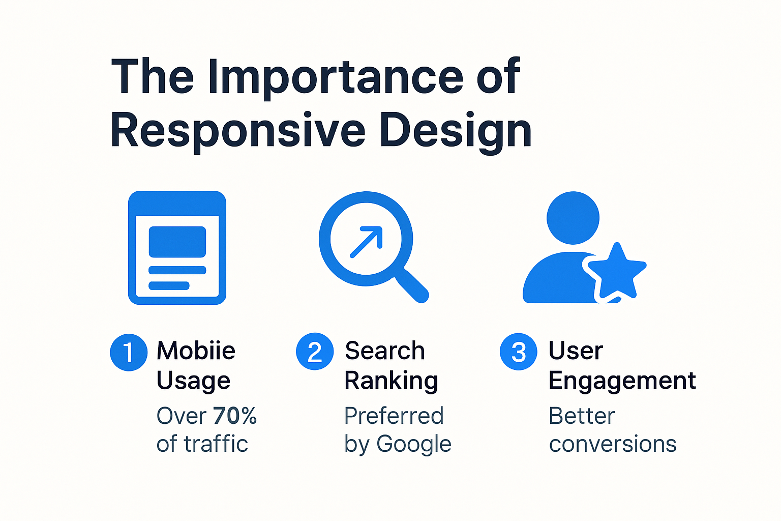
Quick Summary
| Takeaway | Explanation |
|---|---|
| Responsive design is essential for business visibility | With mobile devices accounting for 85% of internet interactions, businesses must adopt responsive design to remain discoverable and competitive in 2025. |
| Improved user experience boosts engagement and conversions | Companies with responsive websites enjoy up to 67% higher user engagement and a 25% increase in conversion rates due to seamless usage across devices. |
| SEO performance heavily relies on responsive design | Search engines prioritize mobile-friendly sites, meaning non-responsive designs suffer from lower rankings and reduced traffic, emphasizing the need for responsive features. |
| Future-proofing requires adaptability and security | Businesses should build responsive websites that can integrate with emerging technologies and maintain robust security protocols to protect user data and privacy. |
| Ongoing optimization is key | Implementing responsive design is not a one-time task; continuous monitoring and adaptation to user behavior and technological trends are vital for success. |
Why Responsive Design Matters for Companies
Responsive design has transformed from a competitive advantage to a critical business necessity in 2025. As digital interactions become increasingly complex, companies must recognize that their online presence directly impacts customer engagement, brand perception, and ultimately, bottom-line performance.
The Mobile-First Reality of Business Connectivity
The digital ecosystem has fundamentally shifted towards mobile platforms. Statista reports that mobile devices now account for approximately 85% of all internet interactions globally. This seismic shift means businesses without responsive design are effectively invisible to a massive potential customer base. Companies that fail to adapt risk losing significant market share and customer engagement opportunities.
Moreover, search engines like Google have explicitly prioritized mobile-friendly websites in their ranking algorithms. This means responsive design is no longer optional but a critical factor in maintaining digital visibility. Websites that do not seamlessly adapt across different screen sizes and devices will experience diminished search engine performance, reduced traffic, and lower conversion rates.
Economic Impact of Responsive Design
The economic implications of responsive design extend far beyond aesthetic considerations. Adobe research indicates that companies with responsive websites experience up to 67% higher user engagement and a 50% reduction in bounce rates compared to non-responsive platforms. These metrics translate directly into tangible business outcomes: increased customer retention, higher conversion rates, and improved return on digital investment.
Responsive design also represents a cost-effective strategy for businesses. Instead of developing multiple versions of a website for different devices, companies can create a single, adaptable platform that provides consistent user experience across smartphones, tablets, desktops, and emerging digital interfaces. This approach reduces development and maintenance costs while ensuring a unified brand representation.
User Experience as a Competitive Differentiator
In an era of increasing digital sophistication, user experience has become a primary competitive differentiator. Forrester Research reveals that a poor digital experience can cost businesses up to 15% of their customer base. Responsive design ensures that users receive a seamless, intuitive interaction regardless of their device, which builds trust, enhances brand perception, and encourages long-term customer loyalty.
Companies that invest in responsive design demonstrate a commitment to user-centric technology. This approach goes beyond technical implementation it signals to customers that the organization understands and anticipates their evolving digital needs. By prioritizing accessibility, performance, and intuitive design, businesses can create meaningful digital connections that transcend traditional marketing strategies.
Responsive design is no longer a luxury it is a fundamental requirement for businesses seeking to thrive in the digital economy of 2025. Companies must view their digital platforms as dynamic, adaptive ecosystems that respond intelligently to user behavior and technological trends.
Below is a table summarizing key statistics on user engagement, bounce rates, and conversion rates that highlight the economic and UX benefits of responsive design:
| Metric | Responsive Design | Non-Responsive Design |
|---|---|---|
| User Engagement Increase | Up to 67% higher | Baseline |
| Bounce Rate Reduction | Up to 50% lower | Baseline |
| Conversion Rate Increase | Avg. 25% higher | Baseline |
| Loss of Customer Base (Poor UX) | — | Up to 15% loss |
Impact on SEO, Traffic, and Conversions
Responsive design has become a pivotal factor in determining a website’s digital performance, directly influencing search engine optimization (SEO), web traffic, and conversion rates. In 2025, businesses cannot afford to overlook the intricate relationship between design adaptability and online success.
Search Engine Ranking Dynamics
Google has implemented mobile-first indexing, which means the mobile version of a website is now the primary source for ranking and indexing content. This fundamental shift underscores the critical importance of responsive design for maintaining and improving search engine visibility. Websites that do not provide a seamless mobile experience are systematically penalized in search results, effectively reducing their digital discoverability.
Research from Moz reveals that responsive websites experience up to 40% better search engine rankings compared to non-responsive counterparts. This performance advantage stems from several key factors: faster page load times, reduced bounce rates, and improved user engagement metrics that search algorithms prioritize.
Traffic Acquisition and User Behavior
Hubspot reports that over 60% of web traffic now originates from mobile devices, highlighting the critical nature of responsive design in traffic acquisition strategies. Websites that fail to adapt to different screen sizes and device capabilities risk losing significant audience engagement. The user experience becomes fragmented, leading to higher abandonment rates and reduced website traffic.
Moreover, responsive design directly impacts user behavior patterns. Nielsen Norman Group studies demonstrate that users are 5 times more likely to abandon a website that is not mobile-friendly. This statistic translates into tangible business consequences: missed opportunities, reduced brand credibility, and potential revenue loss.
Conversion Rate Optimization
The connection between responsive design and conversion rates is profound and measurable. Conversion Rate Experts found that businesses implementing responsive design experienced an average conversion rate increase of 25%. This improvement stems from creating a consistent, intuitive user experience across all devices.
Responsive websites remove friction from the user journey. Whether a potential customer is browsing on a smartphone during their commute or researching on a desktop computer, the seamless interface ensures that critical information and call-to-action elements remain accessible and engaging. This consistency builds user trust and reduces the cognitive load associated with navigating complex websites.
Additionally, responsive design supports advanced tracking and analytics capabilities. Businesses can now gain comprehensive insights into user behavior across different devices, enabling more sophisticated marketing strategies and personalized user experiences.

In the competitive digital ecosystem of 2025, responsive design is not merely a technical consideration it is a strategic imperative. Companies that embrace this approach will find themselves better positioned to attract, engage, and convert digital audiences across an increasingly fragmented device landscape.
To help visualize the key SEO and traffic benefits, here is a table of responsive design’s impact on digital performance metrics:
| Performance Area | With Responsive Design | Without Responsive Design |
|---|---|---|
| Search Engine Ranking | Up to 40% better | Lower/penalized |
| Mobile-originated Traffic | Can capture >60% | Misses major share |
| Bounce Rate | Reduced | Increased |
| User Abandonment (Non-Mobile) | — | 5x higher risk |
| Conversion Rate | Up to 25% higher | Baseline |
Future-Proofing Your Business Website
In the rapidly evolving digital ecosystem of 2025, future-proofing a business website requires a strategic approach that goes beyond traditional web design. Companies must anticipate technological shifts, user behavior changes, and emerging digital interaction paradigms to maintain a competitive edge.
Technological Adaptability and Emerging Platforms
Gartner predicts that by 2026, 80% of businesses will have implemented multi-experience development strategies. This means websites must be prepared to seamlessly integrate across various platforms including smartphones, tablets, augmented reality (AR) interfaces, voice-activated devices, and potentially emerging technologies not yet mainstream.
Responsive design serves as a critical foundation for this technological adaptability. It provides a flexible framework that can quickly accommodate new screen sizes, interaction models, and device capabilities. Tech Crunch highlights that businesses with adaptive web architectures can reduce implementation time for new digital experiences by up to 60%, giving them a significant competitive advantage.
Performance and Scalability Considerations
Future-proofing extends beyond visual adaptability to include performance optimization and scalability. Google Web Performance research indicates that websites with superior performance metrics experience 23% higher user engagement and significantly reduced bounce rates. This means implementing responsive design must incorporate advanced performance techniques such as:
- Adaptive Image Loading : Automatically serving appropriately sized images based on device capabilities
- Intelligent Caching Mechanisms : Reducing load times through sophisticated data storage strategies
- Progressive Enhancement : Ensuring core content remains accessible across diverse technological environments
Security and Compliance Landscape
As digital ecosystems become more complex, responsive design must integrate robust security and compliance frameworks. Cybersecurity Ventures projects that global cybercrime damages will reach $10.5 trillion annually by 2025, making security a critical consideration for web design.
Responsive websites must implement:
- Cross-Device Authentication : Secure login processes that work seamlessly across different platforms
- Data Protection Mechanisms : Ensuring user privacy and compliance with evolving regulations
- Adaptive Security Protocols : Dynamic security layers that adjust based on detected device and network characteristics
Moreover, GDPR compliance and similar global data protection regulations require websites to be not just visually responsive, but also intelligently adaptive in how they handle user data and consent across different digital interfaces.
The most successful businesses in 2025 will view their websites as living, breathing digital ecosystems. Responsive design is no longer just about making websites look good on different screens it is about creating intelligent, adaptive platforms that can evolve alongside technological innovation and changing user expectations.
Companies must invest in flexible web architectures that can quickly integrate new technologies, maintain superior performance, and provide seamless user experiences across an increasingly diverse digital landscape. The websites of the future will be defined by their ability to anticipate and respond to user needs before users even articulate them.
How to Implement Responsive Design Effectively
Implementing responsive design requires a strategic and comprehensive approach that goes beyond simple visual adjustments. Businesses must adopt a holistic methodology that integrates technical expertise, user-centric design principles, and advanced web development techniques.
Foundational Technical Strategies
MDN Web Docs emphasizes that effective responsive design starts with a robust technical foundation. The core principles involve three critical components: fluid grids, flexible images, and media queries. Fluid grids enable layouts to dynamically resize proportionally across different screen dimensions, while flexible images ensure visual elements scale without losing quality or breaking page composition.
Media queries represent the cornerstone of responsive design, allowing developers to apply specific CSS rules based on device characteristics. W3Schools recommends implementing breakpoints that target common device sizes: mobile (up to 600px), tablet (601-900px), and desktop (901px and above). This approach ensures a comprehensive strategy that addresses the majority of digital access points.
User Experience and Performance Optimization
Google Web Fundamentals highlights that responsive design must prioritize performance alongside visual adaptability. This means optimizing assets, minimizing HTTP requests, and implementing efficient loading strategies. Key techniques include:
- Lazy Loading : Deferring image and content loading until users scroll
- Adaptive Image Serving : Delivering appropriately sized images based on device capabilities
- Minimalistic Design : Reducing complex design elements that could impede mobile performance
Performance metrics are crucial. Websites should aim for load times under 3 seconds, with Google PageSpeed Insights providing comprehensive performance evaluation tools that help developers identify and resolve potential bottlenecks.
Advanced Implementation Techniques
Beyond basic responsive principles, businesses should consider more sophisticated implementation strategies. Stack Overflow Developer Survey indicates that modern web frameworks like React, Vue, and Angular offer advanced responsive design capabilities through component-based architectures.
Developers should also incorporate:
- Mobile-First Design Approach : Designing for mobile devices initially, then progressively enhancing for larger screens
- Responsive Typography : Implementing font sizes and line heights that adapt dynamically
- Touch-Friendly Interfaces : Ensuring interactive elements are appropriately sized for touch navigation
Accessibility remains a critical consideration. Web Accessibility Initiative guidelines recommend creating responsive designs that accommodate users with varying abilities, including those using assistive technologies.
Successful responsive design is not a one-time implementation but an ongoing process of testing, refinement, and adaptation. Businesses must continuously monitor user interactions, performance metrics, and emerging technological trends to ensure their digital platforms remain cutting-edge and user-friendly.
Ultimately, responsive design is about creating a seamless, intuitive experience that works flawlessly across every potential user interaction point. It requires a combination of technical expertise, creative problem-solving, and a deep understanding of user behavior and technological capabilities.
Frequently Asked Questions
What is responsive design and why is it important for businesses in 2025?
Responsive design is a web design approach that ensures websites provide an optimal viewing experience across various devices, from desktops to smartphones. In 2025, it is crucial for businesses because 85% of internet interactions come from mobile devices, affecting visibility, user engagement, and search engine rankings.
How does responsive design impact SEO and search rankings?
Responsive design significantly improves SEO by ensuring websites are mobile-friendly. Google prioritizes mobile-responsive sites in its ranking algorithms, meaning businesses that do not adopt responsive design risk lower search visibility and reduced traffic.
What are the economic benefits of implementing responsive design?
Implementing responsive design can lead to up to 67% higher user engagement and 25% better conversion rates. It streamlines development costs by requiring only one website version, ultimately driving better ROI through improved customer retention and engagement.
How can businesses future-proof their websites with responsive design?
To future-proof a website, businesses should adopt responsive design principles that allow for easy integration of emerging technologies, focus on performance optimization, and implement robust security measures. This adaptability ensures a seamless user experience as digital environments evolve.
Ready for a Business Website That Works in 2025 and Beyond?
Are you concerned your business is falling behind because your site is not truly responsive? The article above reveals how non-responsive sites are quickly disappearing from search rankings and missing out on 85% of potential users who are active on mobile devices. Poor user experience and high bounce rates remain major threats to growth and can even cost you a big portion of your customer base. Your next step is to transform your site into a conversion engine that meets the demands of today’s digital world.

At TRAVLRD , we are experts at building modern, custom and conversion-focused websites that look great and drive results across any device. Explore our success stories and see how we help businesses boost rankings, user satisfaction and revenue. Now is the time to take action. Get in touch with us for a free consultation on how our web development and responsive design services can future-proof your online presence. Start your upgrade now at TRAVLRD’s digital development agency and let’s give your business the visibility and performance it deserves.


